Start with the boundary people will actually see
For an event, the most useful colour comparison is not a silver sample held against a colour chart. It is the sample beside the hair that will remain visible near your face. If your own temples show when the wig is worn, their colour becomes a reference for the join. Check both sides rather than treating one temple as representative.
Decide whether you want continuity or a deliberate change. A soft salt-and-pepper blend may preserve a familiar outline, while bright silver can be an intentional statement. Neither is inherently more natural for every wearer. The difficulty comes when you want quiet continuity but choose a shade whose pale lengths and dark roots make a stronger contrast than you intended.
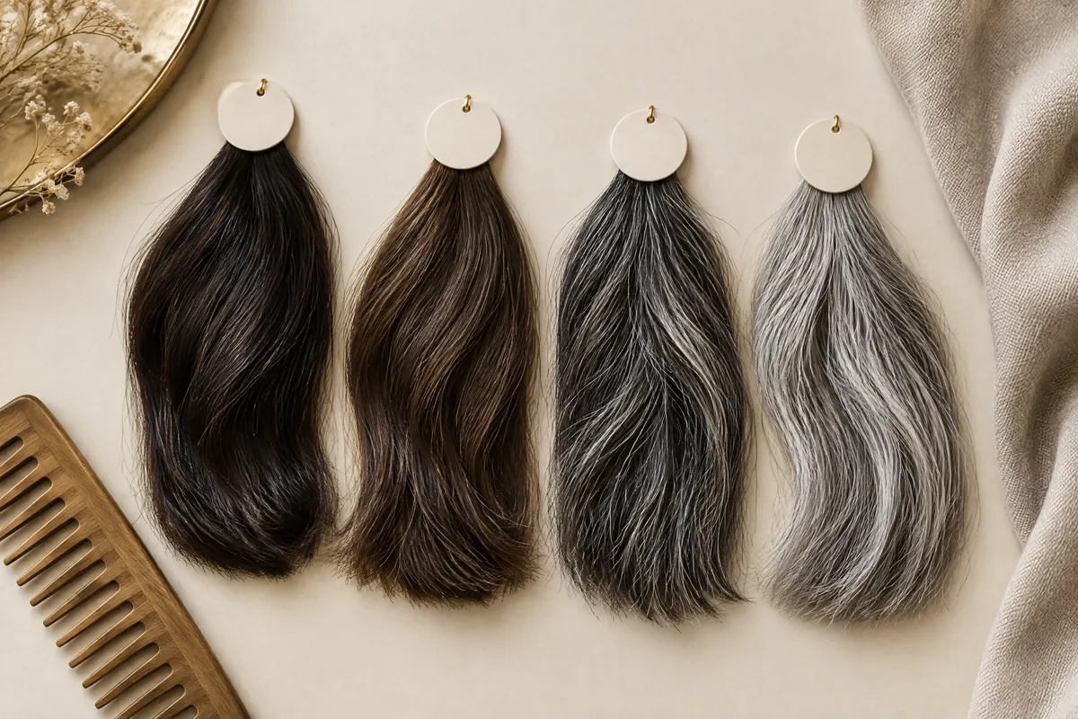
OWNSTRAND’s guide to grey wigs separates grey, silver, white and salt-and-pepper descriptions, while explaining that names are not standardised shade formulas. Use those families to shortlist a direction. Then ask which references belong to the particular style you are considering; a category illustration is not evidence that every shade is offered.
If your natural temple hair will be fully covered, do not invent a matching requirement. Compare the sample beside your face and consider your brows, preferred makeup and overall contrast instead. The choice can be a new colour rather than a replica. Still check the side view: a fringe may conceal a boundary that reappears when hair is tucked back.
Make a fair room-light and flash comparison
Keep the sample and temple in the same frame
Where suitable samples can be viewed, ask permission to place each beside the temple and photograph it. Label the references A and B, retaining the supplier’s shade names separately. Keep the sample close to the hair without covering it. A photograph of the sample alone and a separate selfie are a weak comparison because their lighting and camera decisions may differ.
Begin with ordinary room lighting that resembles where you will spend much of the evening. Use the same position and phone for the paired photographs, and disable beauty filters. Take a room-light image first, then one with flash if permitted. Include the face and temple, not just a close-up of shiny strands. Note whether the phone changed exposure automatically.
Nikon explains that white balance compensates for the colour of scene lighting, and recommends consistent light and checking a test image. That means the photograph is an aid to judgement, not a neutral record automatically produced by every camera. If everything in the frame shifts warmer or cooler, investigate the lighting and camera before attributing the change to the wig.1
A small purpose-made photographic grey card can help someone familiar with white balance assess a colour cast. It is optional, not essential equipment for choosing a wig. Ordinary grey packaging is not a calibrated substitute. More importantly, compare both samples under the same conditions; a technically impressive photograph is unhelpful if one reference was lit differently.
Use a short log instead of deciding which picture looks prettiest. Record each concern separately so that a warm photograph does not distract you from an abrupt root transition. These are observations to record, not expected results for every silver shade:
| Check | Room-light note | Flash-photo note | What the difference suggests |
|---|---|---|---|
| Brightness | Does silver sit close to the temple’s lightness? | Does it become much paler beside the temple? | Compare a softer silver or more visible dark strands. |
| Yellow cast | Is warmth visible in the sample, hair or both? | Does warmth remain, disappear or affect the whole frame? | Separate a shade preference from a lighting cast. |
| Root contrast | Is the root transition gentle or abrupt? | Does the pale length stand out against a dark band? | Discuss root depth and transition, not only grey quantity. |
When silver becomes brighter, do not call it a colour failure
A sample that looks subdued beside your temple in the room may look much lighter in the flash picture. Describe that as a brightness difference first. Do not immediately conclude that the wig has turned white or that its colour is wrong. Look for visible strand detail: a pale area with no detail is a poor basis for judging the actual blend.
Take another permitted image from a slightly different angle, keeping the sample and temple together. If the bright patch changes position or becomes less prominent, highlight placement deserves attention. If the whole silver area remains much lighter than your temple, the overall tonal gap is more relevant. Neither observation gives you a reliable percentage of grey by counting pixels.
The trade-off is straightforward: bright silver offers a clearer statement but may create a stronger distinction from darker side hair. A more muted blend can reduce that distinction but lose some of the luminous appearance you liked. Compare an alternative physically where possible. Do not assume that adding a little dark colour everywhere will preserve the exact silver effect.
When silver looks yellow, check what else changed
Separate room warmth from the sample’s undertone
Adobe explains that incandescent light can create a yellow or orange cast in photographs, while white balance affects all image colours. Mixed lighting can also leave different parts of a picture warm and cool. Therefore, yellow in one banquet-style photograph does not by itself establish that a silver sample is yellow-toned or has discoloured.2
Look at the natural temple hair and any neutral reference in the same image. If the whole scene is warmer, repeat the comparison in a more even setting before rejecting the shade. If the sample still looks warmer than your temple in the same light, record that relative difference. Your useful note is “warmer than my side hair”, not simply “bad silver”.
Consider an illustrative choice between two samples: A appears creamy in room light but more neutral with flash; B looks cooler in the room but too pale in the photograph. If conversation at tables matters most, A’s warmth may bother you more than B’s brightness. If portraits are the priority, you may prefer A. A third, softer neutral blend could be a better compromise.
Do not try to solve this immediately with purple shampoo, dye or a hot tool. A shopping sample is not yours to modify, and a finished piece needs care advice for its actual materials. Ask about an alternative shade first. Any later washing, colouring or heat styling should follow the supplier’s and original manufacturer’s guidance for the specific hair and fibre.
Read dark roots separately from scattered dark strands
A rooted silver shade and a salt-and-pepper blend can both contain dark hair, but they distribute it differently. Roots concentrate darkness near the scalp before transitioning into lighter lengths. Salt-and-pepper descriptions suggest light and dark strands mixed through the style. Ask to see that distinction on the actual reference; the same overall impression of grey can hide very different arrangements.
At the temple, look for a band or step between your own hair, the wig’s root area and the silver length. A dark root might connect well with your side hair but become conspicuous where it meets pale silver. Alternatively, scattered dark strands may soften the length without providing the root depth you want. These are separate adjustments, not interchangeable ways of adding darkness.
Check the intended parting and an ordinary head turn before choosing. Hair swept back exposes more of the front and temple than a forward fringe. Do not judge a rooted shade solely in the pose that conceals its transition. A deeper root can suit a statement style; a softer transition may better suit quiet blending. Choose deliberately rather than treating all contrast as undesirable.
Turn your observations into a zoned grey-blend request
An overall percentage describes how much grey you are discussing, but not its placement, tone or root transition. Two requests described as “mostly grey” could mean a pale front with a darker crown, or an even blend throughout. Start with the zones that affect your appearance, then let a supplier explain which parts can realistically be made or approximated.
OWNSTRAND discusses a custom wig with a percentage of grey hair case by case, including the natural colour to retain and where the grey effect matters most. That supports a specific visual conversation, not a promise that every zoned arrangement is available. Ask whether relevant samples can show the proposed balance before agreeing to it.
| Zone | Observation to describe | Request to discuss | Compromise to consider |
|---|---|---|---|
| Temples and sides | Silver looks much paler than visible side hair. | Retain more of the familiar dark tone near the join. | Less uninterrupted silver around the face. |
| Front and fringe | A pale front is attractive but too stark with flash. | A gentler light-dark mix through the face-framing hair. | A quieter rather than dramatic silver effect. |
| Crown and parting | The dark root reads as a distinct band. | Softer root depth or a less abrupt transition. | Less of the intentionally rooted look. |
| Lengths and back | The tone is pleasing away from the boundary. | Keep that tone while discussing local adjustments. | The finished blend may not duplicate the sample. |
A useful example brief is: “Keep the silver tone of sample A through the lengths. Beside my temples it looks too pale with flash, so I would like more dark strands near the sides. I prefer a softer root transition at my usual parting.” Add which photograph shows each concern. This is clearer than prescribing a global grey percentage.
If the supplier needs a number, relate it to a viewed blend rather than guessing from a screen. Ask whether the number describes the whole piece or a particular area. Also ask how fine or distinct the mixture will look. You can accept an approximate blend while keeping one priority firm, such as avoiding an abrupt dark-to-silver band.
Choose for the event without losing the everyday look
Imagine a dinner where most conversation happens under warm room lighting and the formal photographs use flash. A sample that matches your temple comfortably in the room but appears somewhat lighter in portraits may be acceptable. Rejecting it solely for that difference could lead to a darker piece you dislike throughout the evening. Decide which mismatch is noticeable enough to matter to you.
Now imagine an event where you plan a swept-back style and many close portraits. A root band hidden under a forward fringe becomes a higher priority than a slight warmth through the back lengths. Request attention to the front and temple transition, not a darker wig throughout.
Write down your priorities before selecting the final direction. When two samples both have advantages, a short list helps you choose the compromise you can live with. Bring that list into the colour discussion rather than repeatedly switching between attractive photographs:
- Must keep: the familiar temple colour relationship, or the deliberate bright-silver statement.
- Can accept: a modest change in brightness between room light and flash.
- Would avoid: a yellow-looking front relative to your own hair, or an abrupt root band.
- Must test in style: your usual parting, fringe position and whether you will tuck the sides back.
A phone flash test cannot reproduce every event photograph. A photographer may use different lighting, camera settings and editing. Show the comparison if helpful and explain that realistic hair colour matters to you, but do not ask for a guarantee of identical colour across all images. The sample test is most valuable for choosing your tolerance, not predicting every picture.
Bring a usable brief to the fitting conversation
For a custom human hair wig Hong Kong enquiry, OWNSTRAND describes sample viewing and head measurements, followed by handmade production and a return fitting with washing, cutting and blow-drying. Bring your zone notes into the first discussion, not only the collection visit. Colour distribution and the final cut need to support the same intended look.
OWNSTRAND’s salon is at Unit 2103, 利寶時中心, 50 Hoi Yuen Road, Kwun Tong, Hong Kong. Agree sample-viewing arrangements and photography permission before visiting. If an event date matters, ask how production and the return fitting would fit that date. Do not treat a general service description as confirmation of a particular shade, appointment or completion deadline.
Keep the original shade labels, paired photographs and a short written preference together. At fitting, review the normal parting and side view before discussing finishing touches. Your final decision should answer a practical question: does the temple relationship and root transition feel right in the style you will actually wear, with a room-to-flash difference you can comfortably accept?
Questions & answers
Can I use a photograph of my hair before it went grey?
It can communicate a colour you want to recover, but it should not replace a current temple reference when your side hair will remain visible. Decide whether your aim is matching today’s hair or intentionally returning to a previous look.
Should I compare samples while wearing my event outfit?
Bring a useful reference for the outfit, especially its neckline, and compare the hair beside your face. A statement silver colour may suit the outfit while still contrasting with your temples. Keep those two preferences separate rather than choosing by clothing alone.
What if photography is not allowed during sample viewing?
Respect the restriction. Make written notes under the permitted lighting, retain the sample identifiers and ask whether the supplier can provide an approved reference. Do not photograph staff, other customers or samples without permission.
Does a more expensive wig guarantee better silver colour?
No. Price may reflect construction or other specifications, but it does not establish a closer temple match or your preferred root transition. Compare the relevant shade and blend directly, then assess the separate value of fit, construction and styling.
Can I request different blends at the left and right temples?
You can explain a visible difference and ask whether an asymmetric arrangement is possible. It may not be available, and a softer shared blend may be a practical compromise. Do not assume that a custom service can reproduce every strand pattern.
Put the next step into practice
Build a clearer understanding of hair shape and everyday styling through learning at Canvas. Hair styling courses in Hong Kong。
Explore more practical styling and selection notes. Canvas hair and beauty journal。
Tell the team which hair styling techniques you would like to learn. Contact Canvas Academy。
Sources & further reading
- The beginner’s guide to White Balance — Nikon
Explains camera white balance, consistent lighting, test photographs and photographic grey cards, helping distinguish a lighting shift from a shade preference.
- Adjusting white balance settings to improve photos — Adobe
Describes yellow-orange casts from incandescent light and the difficulty of correcting mixed lighting, useful when judging warmth in a silver sample photograph.