Why the same colour reads differently straight, waved and tucked
Straight hair can present light strands as long, relatively uninterrupted lines. A waved style bends those strands across different surfaces and overlaps some sections. What looks like an isolated line in one view may join a brighter group in another. This is a useful way to inspect a photograph, not a rule that waves always make highlights softer.
An ear tuck changes the view again. Hair that normally covers the side is moved away, while several strands can gather at the bend behind the ear. A bright hairline may become more prominent. Equally, a darker side section may become visible beneath a lighter surface. Neither change requires the actual colour to have changed.
- Straight: follow each light line from the root area towards the ends. Notice where it stays separate.
- Waved: look for lines that meet visually on a bend, and darker sections that disappear underneath.
- Tucked: check the exposed temple and side, then the brighter bundle behind the ear.
Vit So's hair highlights service information discusses width, spacing and contrast rather than treating a technique name as the entire design. Those are useful starting points when describing why you like the colour in one hairstyle but not another. Bring the view you actually wear, including a side photograph if you often tuck your hair.
Separate strand width from the depth you want to keep
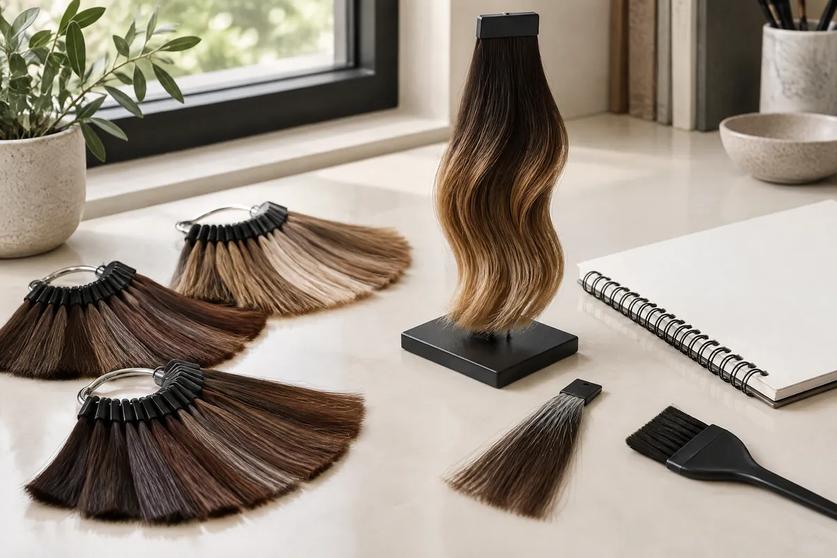
Four choices affect the visible pattern: the width of each lighter ribbon, the spacing between ribbons, the difference from the base colour, and where brightness is concentrated. They interact. A very fine pale line can stand out against deep brown hair. A wider brown ribbon closer to the base can have a gentler contrast despite its size.
Fine weaving is not a promise of subtle colour
Wella Professionals defines babylights as highlights made on much finer sections than traditional highlights. Its examples range from scattered strands on brown hair to abundant fine strands producing bright blonde. The category therefore tells you something about section size, but it does not settle the total brightness or contrast you will see. 1
When discussing babylights, describe how much of your darker base should remain visible across the top and sides. If your main wish is to keep a brunette impression, that matters more than requesting the smallest possible weave. If you want an overall brighter appearance, closely arranged fine strands may be part of that discussion.
A spacing sketch makes retained depth easier to explain
In this design sketch, L means a visible lighter ribbon and D means darker hair left visible between ribbons. It is not a foil map or a measurement. All the symbols describe the view of the finished hair, not how much hair should be chemically processed.
Spaced ribbons:
L D D D L D D D LClosely arranged ribbons:L D L D L D L D LBright cluster with a darker gap:L L L D D D D L L
The first sketch keeps more darker space but can still show clearly separated lines. The second distributes brightness more continuously and may reduce obvious gaps while looking lighter overall. The third can read as a bright panel beside a dark one. More retained depth is not automatically less stripy; its distribution matters as well.
Choose between clear ribbons, a brunette glow and overall brightness
Start with the appearance you want to recognise at arm's length. Clear ribbons are a valid preference, not a failed blend. They can make the line pattern part of the hairstyle. A brunette glow keeps the darker base visually dominant. Overall brightness changes the balance more substantially, even if no individual strand looks particularly wide.
Consider a hypothetical shoulder-length dark-brown cut worn straight for work. The reader likes a waved photograph because it has warm reflections, but dislikes the pale lines in a second image. The useful request is not simply “softer highlights”. It is “keep the dark background, use less contrast than the pale reference, and show me how the lines would sit straight”.
Before selecting a shade, finish these statements:
- From a normal viewing distance, I want my hair to read as mostly dark, balanced light and dark, or mostly light.
- I want individual ribbons to be visible, barely visible, or visible only in selected areas.
- The place where I most want brightness is the face, the top, the moving lengths, or another named area.
There is a trade-off between preserving distinct darker gaps and making the surface look uniformly bright. Both can be attractive. Asking for “lots of brightness, no lines, and a very dark overall result” may describe competing priorities. Choose the priority that matters most and let the salon explain what can realistically be combined.
Build a paired-reference brief instead of collecting similar pictures
Choose one image for the line pattern and a second for the overall lightness. They need not show the same hairstyle. The important step is to say what each contributes. A beautiful waved image can be your tone reference without becoming the placement reference for straight hair. This avoids asking one photograph to answer several different questions.
| Reference pair | Keep from the first image | Keep from the second image | What to explain |
|---|---|---|---|
| Straight brunette and waved brunette | Visible spacing on straight lengths | Warmth of the lighter pieces | I like the first pattern, not the second image's grouped ribbons |
| Straight pale ribbons and softer brown ribbons | The position around the face | The lower contrast with the base | Keep the placement, but not the pale colour difference |
| Hair worn loose and tucked behind the ear | Darker background through the back | Brightness visible at the temple | The side view matters as much as the loose front view |
| Bright top and darker all-over design | Lightness at the crown | Depth through the sides and ends | Brighten selected areas rather than copying the whole first image |
These are hypothetical pairings, not a set of promised salon results. Add one sentence beginning “I would change…” beneath each image. For example, “I would change the repeated pale lines beside the parting, but keep the warm tone.” That separates a colour preference from a spacing preference more clearly than calling both pictures natural.
Match coverage to the hair you expose every day
Coverage describes the areas considered for highlights. Density describes how much lighter hair sits within those areas. They are different decisions. A design covering several parts of the head can still retain plenty of depth. A concentrated bright surface can look light from the front while leaving the underside much darker.
For full head highlights, Vit So describes coverage across the head rather than lightening every strand. Discuss the hairline, crown, sides and nape separately if you expose them in different styles. The service label alone does not tell you how bright each area will become, or which darker sections you will still see.
If you switch between a centre and side parting, show both. A line that sits away from one parting may sit directly beside the other. If you wear a bob tucked at one ear, the visible side deserves attention. If you usually tie longer hair back, include that view rather than basing the entire plan on loose hair.
Also mention a planned haircut. Removing a substantial length changes which highlighted ends remain and how upper layers cover the hair beneath. It can be more useful to settle the intended cut shape before deciding where the light ribbons should appear. A colour reference with long layers may not describe the visible pattern on a blunt bob.
Distinguish a line-pattern concern from a hair-condition concern
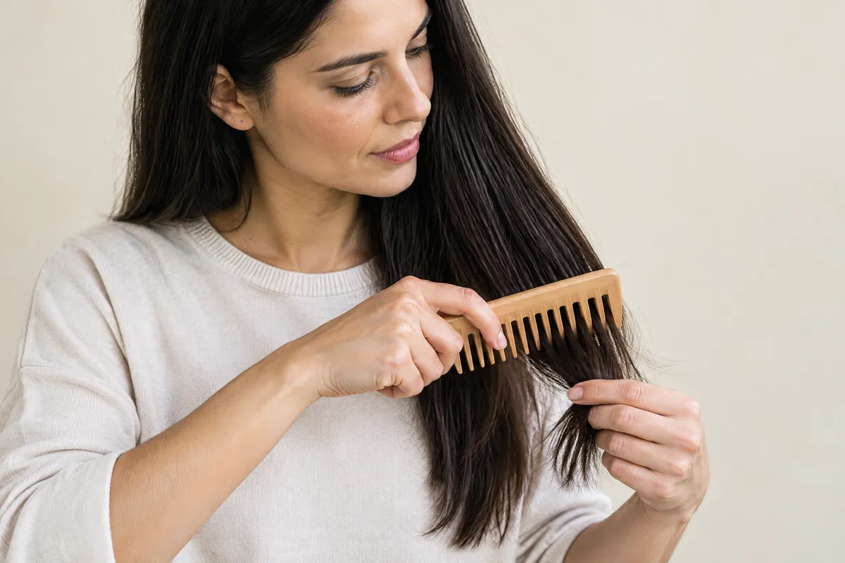
A strong light line is a visual feature. Roughness, catching during combing or visible breakage is a condition concern. They can occur together, but adjusting the apparent contrast does not by itself address fragile hair. The American Academy of Dermatology identifies colouring, perming and relaxing as practices that can damage hair; previous processing therefore belongs in the colour discussion. 2
Tell the salon about old dark dye through the lengths, previous lightening and any perming or straightening. Include home colour and henna where relevant, with approximate dates and product names if you have them. A photograph may show the colour boundary but not reveal every past treatment. Do not leave out an old service simply because the current colour covers it.
If existing highlights already look too prominent, separate the concern into width, contrast and location. Is one broad ribbon bothering you? Are all the light pieces too pale against the base? Is the brightness clustered beside the parting? These observations make the discussion more specific than requesting that the whole head be made darker.
Do not add more lightening at home merely to copy the waved reference. Ask whether changing tone, redistributing depth or leaving some areas alone could address the visual concern, and what each would involve on your hair. These are options for assessment, not interchangeable fixes. A cosmetic treatment can improve feel or manageability; it does not make further chemical work automatically suitable.
Prepare a small, useful set of photographs and notes
Photograph dry hair in soft daylight with no colour filter. Keep the background and lighting similar across views. Take your normal straight or natural-texture view first, then a tucked view. Add a waved view only if it is already part of your routine; there is no need to use hot tools solely to prepare a colour enquiry.
| Bring | How to prepare it | Decision it helps with |
|---|---|---|
| Front and back in your normal parting | Let the hair fall as you usually wear it | Surface lines and everyday overall brightness |
| Side with hair tucked | Show the temple and hair behind the ear | Exposed placement and grouped light strands |
| Root, length and end close-ups | Keep the lighting consistent; avoid filters | Existing colour boundaries and uneven lightness |
| Two annotated references | Identify one feature to keep and one to change | Pattern versus tone preference |
| Processing notes | List approximate dates and known products | Assessment of the starting hair |
| Routine and visit priorities | Note heat styling, intended haircut and budget | A practical plan and agreed scope |
Ask for the proposed balance in ordinary words: “Where will the darker hair still be visible when it is straight?” Then ask which sections would look different when tucked. You can use the L-and-D sketch to clarify a preference, but leave sectioning, products and processing decisions to the professional assessing your actual hair.
Before agreeing to work, clarify whether the plan includes new lightening, toning existing strands, a haircut or finishing. Ask how a future visit might differ from the first one. A technique name does not establish the inclusions or a personal quotation. A concise brief about the effect and the starting condition is more useful than requesting a fixed number of foils.
Keep colour inspection separate from repeated heat styling
You should not need to curl your hair every day to tolerate its colour pattern. If the straight view matters most, discuss that before the appointment. For occasional waves, choose a styling routine that suits your hair's condition. The American Academy of Dermatology recommends the lowest heat setting, limited hot-tool contact and less frequent heat use to reduce damage. 2
For everyday handling, use conditioner after shampooing and absorb water with a towel rather than rubbing the lengths, as the same guidance recommends. 2 Ask for care instructions for the actual colour service. Avoid adding several tone-changing products because an indoor photograph looks warm; first compare the intended colour and your hair in similar daylight.
Questions & answers
Can I bring a reference with a different natural hair texture?
Yes. Identify the feature you want to borrow: warmth or overall lightness, for example. A curly reference need not determine placement on straight hair. Pair it with a straight line-pattern reference and a photograph of your usual texture.
Is a darker root area the same as wider gaps between highlights?
No. A darker root describes the transition near the scalp. Wider darker gaps describe spacing between light strands. You may want either or both. Point to the relevant area so that a root preference is not mistaken for lower density throughout.
Should both sides look identical if I usually tuck one ear?
Not necessarily. Matching placement and a balanced tucked appearance are different goals. Decide which matters more, show both sides, and discuss how the colour would look if you changed the tucked side.
Can a monochrome photograph help me choose highlight contrast?
It can help you notice light and dark areas, but it removes warmth and coolness. Camera processing may also alter contrast. Keep the original colour image alongside it; do not select a shade from the monochrome version.
What if my references show opposite colour preferences?
Rank the features. You might put retained dark depth first, warm tone second and face brightness third. Say which you could compromise on rather than asking for a very blonde and predominantly brunette result equally.
Put the next step into practice
Develop your understanding of shape, cutting and styling with structured learning at Canvas. Hair styling courses in Hong Kong。
Explore practical guides for a clearer plan before your next style change. Canvas hair and beauty journal。
Tell the team which cutting or styling skills you would like to learn. Contact Canvas Academy。
Sources & further reading
- Your Everything Guide to Babylights — Wella Professionals
Explains that babylights use finer sections than traditional highlights, with examples ranging from scattered brown-hair accents to abundant fine blonde strands. Helpful for separating section size from overall brightness.
- How to stop damaging your hair — American Academy of Dermatology
Identifies chemical processing and heat styling as potential sources of damage, and offers practical guidance on conditioning, gentle towel handling and reducing hot-tool exposure.