Start with the dark spaces, not the blonde shade
A dark base is not simply the colour waiting to be replaced. It can be the background that gives lighter strands their shape. In design terms, this is negative space: the areas left visually quiet so that other areas stand out. With hair, that means noticing the dark crown, gaps between ribbons and depth underneath before choosing the lightest shade.
Try reading an inspiration photograph in reverse. Ignore the blonde first and trace the dark sections from the parting downwards. Does the dark colour continue beside the brighter pieces, or stop across most of the head? Two photographs with similar pale tips can have very different overall impressions because one retains dark channels while the other has a largely light lower half.
Design exercise: cover the light areas in a reference with your finger. If you still like the shape of the remaining dark hair, that depth deserves a place in your brief.
Compare three places for the contrast to live
Front brightness works when you want light near the face without making the entire back equally pale. Decide whether the front should be a clearly separated ribbon or a scattering of smaller pieces. Keep an eye on the dark hair beside it: a narrow pale piece against a very dark section may read as a stronger line than a broader, softer brown highlight.
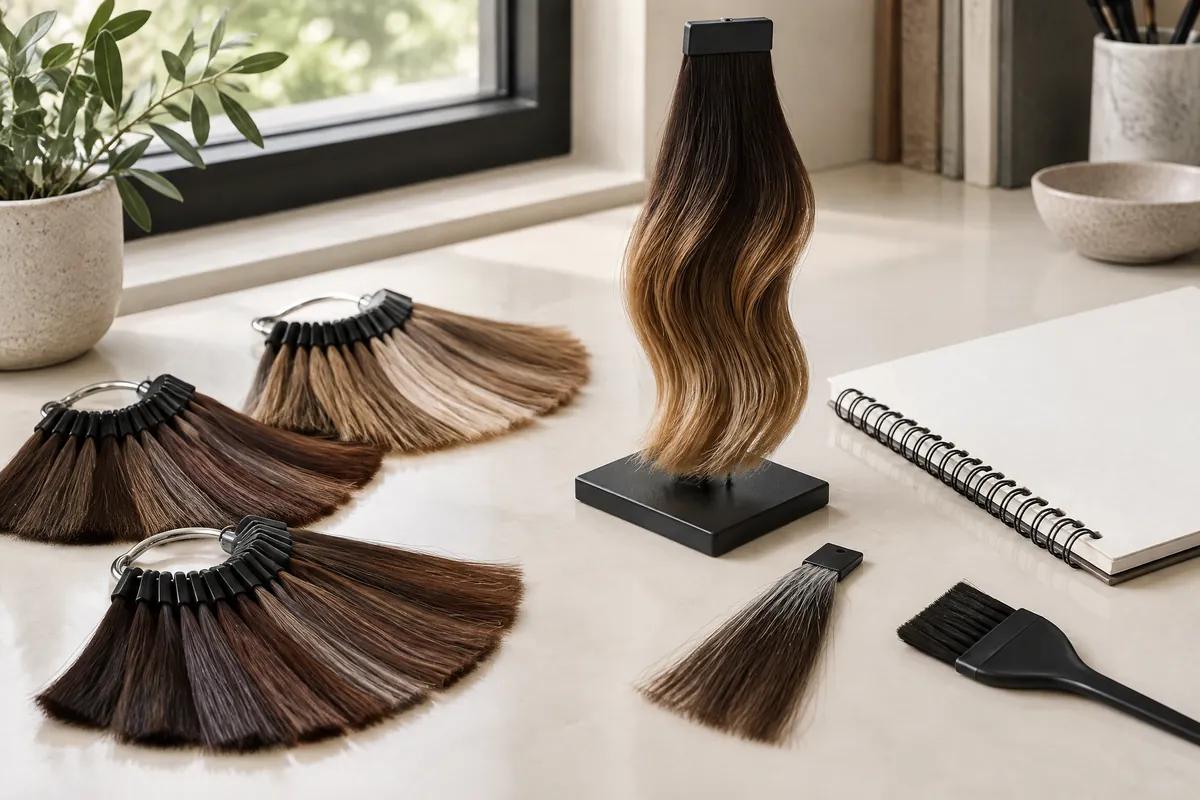
A long transition spreads the visual change through more of the length. Instead of moving directly from dark hair to pale tips, the design gives intermediate brown more room. This can suit someone who likes movement through the lengths but dislikes a distinct two-colour division. It still needs a decision about where the darkest area gives way to visible lightness.
Concentrated ends place the strongest contrast low down. The upper hair can remain predominantly dark while the bottom becomes the main statement. This is not automatically the most understated option: very pale ends can create a bold lower outline. A smaller bright section in a closer brown shade offers a different balance from a large blonde section.
| Main layout | Where attention goes | Dark space worth preserving | Main trade-off |
|---|---|---|---|
| Brighter front | Face and front outline | Crown and depth beside the front pieces | More noticeable in front-view photos |
| Long transition | Movement through the lengths | Dark channels between lighter ribbons | More intermediate colour, less concentrated pale area |
| Concentrated ends | Bottom edge and lower silhouette | Upper lengths and selected inner sections | Trimming can remove a large share of the statement |
These are design directions, not three fixed salon packages. A combination can work too, but give it a hierarchy. For example, a hypothetical brief might prioritise softly brighter front pieces, retain a dark back and add only a little light at the tips. That is clearer than requesting the front, blend and ends all be equally prominent.
Separate painted placement from an overall fade
Wella describes hand-painted highlighting as an application technique, while ombré describes a more uniform transition from dark roots towards light ends. It also explains that freehand painting can be processed in foils. The visible result and the tools used are therefore related, but they are not interchangeable descriptions. A soft-looking photograph does not tell you how it was processed.1
When discussing balayage with Vit So, describe the placement you actually like: broken ribbons, a darker crown or lightness appearing at different heights. The service information distinguishes painted brightness from the overall transition. Let the stylist choose an application approach around that brief and your starting hair rather than treating the technique name as a formula.
If the appeal is a dark upper area flowing into a broadly lighter lower section, ombre hair is the relevant overall effect to discuss. Specify whether the ends should look fairly continuous or still contain dark strands. A smooth fade and a uniformly pale bottom are separate choices; you can want one without wanting the other.
The useful distinction is between a line and a field of colour. A line is an individual bright piece you can follow down the hair. A field is a larger area that reads light as a whole. Look at both in your references. This reveals whether you mainly want brighter strands within brunette hair or a visibly lighter lower silhouette.
Test the layout in the hairstyles you actually wear
A curled back-view photograph is only one arrangement of the hair. If you normally wear it straight to the office, use that finish for your own comparison. Take an ordinary-light front photograph, a side view and a back view. Keep the parting familiar. You are checking which sections are visible, not trying to create a polished portfolio image.
Then tie your hair as you usually do, whether that is a low ponytail, a bun or a clip. Lifting the lengths reveals surfaces that were hidden when loose. Notice the sides and nape as well as the tail. A bright outer layer with a dark underside may produce a much more divided arrangement when pulled back. Decide whether that contrast appeals to you.
Use these three checks before choosing the coverage:
- Tuck both sides behind your ears and check whether the front brightness still feels balanced.
- Move to your occasional side parting and note whether a bright piece becomes a dominant stripe.
- Gather the hair into your usual tie position and identify dark areas you would want to keep or soften.
You do not need matching brightness on every exposed surface. For a hypothetical mostly dark office look, a dark nape and brighter ponytail ends may be exactly the intended effect. For someone who wants light ribbons visible in a bun, the same coverage could feel incomplete. Describe the tied-back appearance as a separate preference, not an afterthought added once the hair is coloured.
Read the transition in straight hair and around the haircut
Follow the start of each bright line
Look at where individual lighter pieces first become visible. If they appear at different heights, the dark-to-light boundary may look interrupted. If many begin at a similar level, your eye may read a horizontal band. Neither is necessarily a mistake. The question is whether you want a broken transition or a more deliberate boundary within your overall shape.
Waves turn different hair surfaces towards the light and overlap sections. Straight hair makes it easier to follow a ribbon from its beginning to its end. Ask to compare references with both finishes if you regularly alternate between them. A blend that appeals to you in large curls may not communicate enough about the lines you will see after a simple blow-dry.
Place the lightest section after deciding the cut
The haircut sets the space available for colour. If you plan a substantial trim, mark the intended new bottom edge before discussing the pale section. Otherwise, the lightness you most wanted may sit mainly in the length being removed. Face-framing layers also need their own starting points; the front and back do not always finish at the same height.
For a shoulder-length cut, compare the transition as a proportion of the visible hair rather than borrowing a placement from a waist-length reference. A blend that occupies only part of long hair can dominate a shorter outline. Ask which matters more to you: keeping a large dark upper area, showing intermediate brown, or retaining enough bright length after the cut.
Useful brief: “Keep the crown dark, interrupt the transition with dark strands, and make the ends noticeable after the planned trim.” This describes a layout without prescribing a chemical process.
Map old dark dye before choosing how pale to go
A dark surface colour does not reveal the full history underneath. New natural roots, repeatedly tinted middle lengths and ends that were once bleached can sit on the same head. Wella's professional guidance distinguishes lifting virgin hair from reducing existing oxidative colour depth, and states that tint alone is insufficient for that latter task. An old dark dye changes the planning question.3
Draw a simple roots-to-ends history on paper. Mark where black or dark-brown dye was applied and whether it covered all the lengths each time. Add earlier bleach, henna, perms or straightening still present in the hair. Approximate dates are useful; if you cannot remember a product or treatment, record that uncertainty rather than describing the hair as untreated.
Vit So's discussion of balayage on dark hair addresses retained depth, contrast and natural versus dyed-dark starting points. It is relevant when your reference has pale ends but your own lengths have old artificial colour. Use the contrast you like as the starting goal, then consider whether a less pale version would still satisfy that goal.
Greater lightening also brings a hair-condition trade-off. The American Academy of Dermatology notes that stronger lightening can cause more damage, and cosmetic treatments can leave hair dry and brittle.2 Describe roughness, frequent tangling or existing breakage rather than hiding those details behind a glossy reference. A gradual-looking colour blend is a visual effect, not evidence of gentle processing.
Build a one-page brief with a real alternative
Choose a main layout and an alternative you genuinely like. If pale tips are the priority, your alternative might keep the same placement with warmer brown brightness. If retaining a dark identity matters more, it might reduce the width or number of light sections instead. “Anything less damaging” is too vague to show which part of the design you are willing to change.
Bring a small set of references with different jobs. One should show the distribution of dark and light; another can show the tone you prefer. Add your own loose and tied-back photographs. Label the feature you want from each, such as “this dark crown” or “this shorter pale section”, rather than asking for every detail to be copied.
| Prepare | What to record | What it helps decide |
|---|---|---|
| Placement reference | First visible light, dark gaps, brightest area | Front-led, blended or end-led design |
| Everyday photographs | Usual parting, straight finish, tied-back view | Which surfaces need attention |
| Hair history | Products, approximate dates and treated zones | Whether old colour needs separate assessment |
| Planned haircut | New length and face-framing layers | How much coloured length will remain |
| Preferred alternative | Shade or coverage you would accept | Which design priority survives a change of plan |
Match the work and care to the design you choose
Vit So lists a standalone Balayage/Ombré service with one bleaching session. Its women's wash, cut and blow-dry combination additionally lists one toner and pre-colour hair protection. These are different stated scopes. If you want the dark base tinted, old colour corrected or further lightening considered, raise those as separate tasks rather than assuming the design name includes them.
Before agreeing to the work, distinguish three items in the proposed plan: the haircut, the distribution of lightness and the finishing tone. Ask what is included and obtain a quotation for additional work. Pre-colour protection is a preparation item, not a guarantee that treated hair will remain unchanged. Your preferred layout should still make sense if the final lightness is adjusted.
For later upkeep, judge tone separately from placement. Wella notes that lightened pieces remain while the toner over them may need refreshing.1 If the ends look warmer but their position still suits you, describe the warmth before requesting more bleach. If a trim has removed the bright section, that is a layout change rather than simply a tone concern.
Keep care practical: follow the instructions for your actual service and protect dyed or bleached hair from strong sun, as the American Academy of Dermatology advises.2 Your next decision should come from what has changed—tone, root depth, the cut or the condition of the ends—not from automatically repeating the entire original colour process.
Questions & answers
Will a cooler tone make the contrast less obvious?
Not necessarily. Tone describes warmth or coolness; contrast also depends on lightness, width and surrounding dark hair. Pale cool ends remain noticeable against a dark base. Compare brightness first, then choose a tone within the agreed lightness.
Can I have light tips without changing my roots?
That is a possible design direction, but leaving natural roots alone is different from adding a darker root tint. State which you mean. Existing colour through the lengths and the hair's condition determine how the lighter section can be approached.
Should I add more brightness if my hair is very thick?
Not automatically. First see whether the existing or proposed brightness is hidden underneath, visible only at the surface, or lost when gathered into a tie. Changing placement may address visibility better than making every light section paler or colouring more hair.
Can a small test section show exactly how the whole design will look?
No. A strand assessment may help the stylist judge a section's response and condition, but it does not reproduce the finished distribution across the head. Uneven treatment histories may require attention to more than one area. Ask what the assessment can establish for your particular hair.
How can I explain a reference that feels too stripy?
Point to the specific lines you dislike and identify whether they are too pale, too wide or too isolated against the dark base. Those are different adjustments. Also show a preferred example with your usual straight or wavy finish so the discussion is about visible lines, not a vague request for softness.
Put the next step into practice
Develop your understanding of shape, cutting and styling with structured learning at Canvas. Hair styling courses in Hong Kong。
Explore practical guides for a clearer plan before your next style change. Canvas hair and beauty journal。
Tell the team which cutting or styling skills you would like to learn. Contact Canvas Academy。
Sources & further reading
- What is Balayage? Your Complete Guide — Wella Professionals
Explains hand-painted highlighting, ombré's more uniform dark-to-light transition, foil-assisted painting and why changing toner is different from changing lightened placement.
- Coloring and perming tips for healthier-looking hair — American Academy of Dermatology
Describes dryness and brittleness associated with cosmetic treatments, the damage trade-off of greater lightening and sun protection for dyed or bleached hair.
- How to Lighten Hair Without Bleach — WellaStore
Distinguishes bleach-free lifting approaches intended for virgin hair from reducing existing oxidative colour depth in previously coloured lengths.