Read the brown underneath the shine
A brown that looks almost black at your desk can look amber beside a window. Before requesting a darker shade, ask which part bothers you: the overall lightness, the golden or reddish cast, or the bright band across a glossy surface. These lead to different conversations. Darkening everything may change lengths you already like while leaving your preference for less warmth poorly explained.
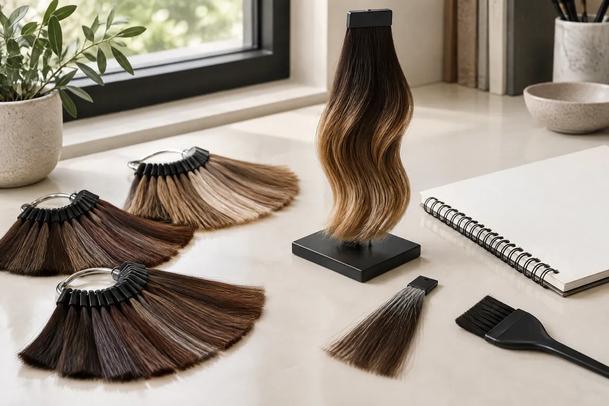
For this comparison, depth means how light or dark the hair looks overall. Reflection means the colour impression where light catches it. Look at both a lit surface and a section turned gently away from the light. Neither is a formula reading. Together they help you describe whether you want a deep outline with a warm sheen or a visibly lighter brown throughout.
Colour appearance depends on illumination and on how an object reflects that light. X-Rite explains that two physical colours can match under one light source but differ under another, a phenomenon called metamerism. A change in the appearance of your own hair is not, by itself, evidence of that specific phenomenon. The useful lesson is to compare under more than one source.1
Start with three separate questions:
- How deep should the shaded hair look?
- Which reflection do I enjoy: golden, reddish or quieter brown?
- Do I want brighter strands, or only a softer overall impression?
Give each light a different job
Choose a window with soft daylight, an ordinary indoor light you spend time under, and a modestly shaded position where the hair remains visible. Use dry hair in your usual arrangement. Keep direct sun out of the first check: a dazzling surface makes it harder to compare the lengths below it. Window light is useful context, not a standardised colour-measuring instrument.
Window light reveals the reflection
Face partly towards the window and slowly turn your head. Watch where the bright area appears and what colour it suggests. Then look behind the ear and underneath the lengths. If the surface turns gold while the less-lit hair remains deep brown, write both observations. Do not describe the whole head as light brown solely because one broad reflection looks bright.
Indoor light reveals your everyday preference
Repeat the view under your normal room or office lighting. An amber lamp and a cooler overhead light may give different impressions. X-Rite's incandescent example illustrates how a light source with more red energy can make objects appear redder; it does not mean every indoor lamp behaves identically.1 Record the actual setting rather than calling all indoor light warm.
| Viewing condition | Main question | Useful note |
|---|---|---|
| Soft window light | Which reflection becomes visible? | Golden surface; shaded lengths still deep |
| Usual indoor light | Do I like the colour where I live or work? | Brown is subtle at the desk; outline feels right |
| Gentle shade | How does the less-lit hair compare with my roots? | Ends remain lighter; crown stays deep |
Use the shaded view to compare areas, not to assign a salon level number. If it is too dark to distinguish strands, move back towards the light. Missing detail is not proof that the colour is dark enough.
Make photographs comparable, not merely attractive
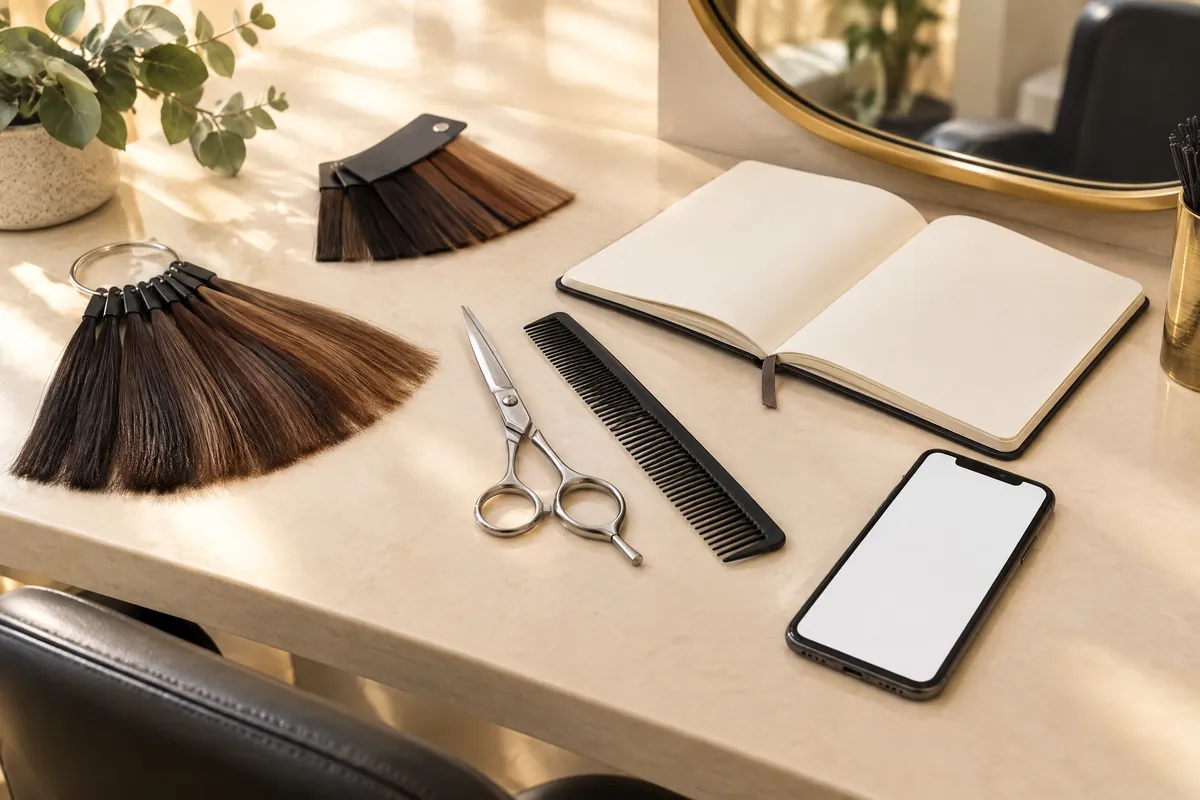
A useful reference includes the parting, a side and enough length to show the colour distribution. Keep the full picture as well as any detail you like. A cropped curl may hide deep roots, a bright panel underneath or ends that are much lighter than the crown. Those missing areas can completely change what the reference is asking for.
Switch off beauty filters and avoid changing saturation, warmth or exposure after capture. Even then, an unfiltered photograph is not a calibrated colour sample. Nikon explains how white balance compensates for lighting and shows that different settings can render the same scene differently.2 A picture can communicate a preference without proving that two browns have the same depth.
For your own record, use the same device and an uncluttered background where practical. Keep the framing similar and include a familiar neutral object, such as a plain grey top, as context. If that object also looks much warmer in one photograph, note the whole-scene shift. Do not digitally cool only the hair until it resembles your favourite reference.
Keep the photo set small enough to discuss:
- One whole-head view in soft daylight.
- One comparable view under your usual indoor light.
- One detail showing a root boundary, lighter strand or uneven area.
Choose references with lighting and texture close to each other. When that is impossible, annotate the feature you want rather than ranking the photographs from darkest to lightest.
Follow a bright line before calling it a highlight
A smooth curve can produce a broad bright band that changes position as the head turns. A deliberately lighter strand belongs to a particular piece of hair, although its brightness also changes with illumination. Watch whether the feature seems to move across the surface or stays with a section. This is an observation clue, not a foolproof test of how the colour was created.
Gently separate a small section with your fingers and look at it in two positions. Does it remain noticeably lighter beside adjacent hair, or become deep when turned away from the window? Compare the crown with the lower lengths too. A head of hair with dark roots and light ends asks for a different colour distribution from one with an even brown base and bright surface shine.
Texture changes the view. Waves alternate lit curves and shadowed dips; straight hair can make a continuous bright line more obvious. If you normally leave your hair straight, include a straight reference rather than choosing only tonged waves. For a ponytail, look at the sides and underside. A front photograph may miss the areas you see when your hair is tied up.
Before choosing between an overall change and selected brighter pieces, write down:
- Where the deep brown should remain.
- Where lighter hair would be welcome.
- Whether visible ribbons would feel too patterned.
Vit So's discussion of brown hair colour compares depth with colour distribution. It is a useful companion when the real choice is between a lighter base across the head and brighter pieces within a base you want to keep.
Build a wardrobe-and-colour observation sheet
Choose two tops you genuinely wear: perhaps your navy work shirt and an off-white weekend T-shirt. Observe the same dry hair beside each neckline in window light and ordinary indoor light. Keep makeup and styling reasonably similar so the outfit comparison stays easy to follow. The purpose is to identify an impression you enjoy, not to assign yourself a colour season or a mandatory shade family.
Use plain observations rather than judgements such as flattering or wrong. You might prefer a golden reflection beside navy but feel it draws too much attention beside cream. Equally, you may like that stronger contrast. Clothes, background and illumination belong to the viewing situation; the sheet records your response to them, not a universal rule about your complexion.
| Outfit and setting | Depth observation | Reflection observation | Preference to discuss |
|---|---|---|---|
| Navy shirt, window | Deep outline | Golden on the surface | Keep depth; enjoy soft gold |
| Navy shirt, office | Mostly deep brown | Warmth less obvious | Do not lighten the whole head |
| Off-white top, window | Ends seem brighter than crown | Red-gold near the face | Less red around the face |
| Off-white top, room light | Crown still looks deep | Warmth noticeable at ends | Review ends before changing roots |
This is a hypothetical example, not a client result. Its strongest conclusion is not a shade name: it is that the person likes depth but wants to discuss a particular reflection near the face. Your sheet might instead reveal that you want the entire brown to stay visibly lighter indoors. That points towards a different priority.
Use shade names as labels after the comparison
Chocolate, chestnut and mocha can help you collect inspiration, but they do not form a dependable darkest-to-lightest ladder. One chocolate reference may contain deep neutral-looking lengths; another may feature warm ribbons and a brighter base. Keep the name alongside a description of the specific shaded area and surface reflection that attracted you.
For a closer comparison of chocolate brown hair, Vit So separates the brown base from red or golden warmth. Pair that reference language with your observation sheet. If two saved images carry the same label, identify their difference rather than expecting the label to resolve it.
A useful request might be: 'Keep the depth in photo A, but I prefer the softer golden reflection in photo B. The red near the face in photo C is too strong for me.' That combines preferences without prescribing a mixture. Include a quieter alternative if your first choice depends on an amount of lightening you would rather avoid.
Match the visual goal to the hair you have
Your sheet describes the appearance you want; it does not determine the chemical route. Separate untreated roots, repeatedly coloured mid-lengths and any previously lightened ends in your history. Include home dye, henna, bleaching, straightening and perms, with approximate dates and areas. A uniform-looking brown may contain very different treatment histories from root to tip.
Point out rough ends, persistent tangling or breakage you have noticed. If keeping length matters more than reaching the brightest reference, say so. The American Academy of Dermatology explains that larger lightening changes require higher peroxide volumes and can cause more damage.3 That makes the amount of processing a genuine trade-off, not merely a question of which brown looks nicest.
Ask what the proposed hair colour work would change at the roots, through the lengths and at the ends. Vit So distinguishes tinting coverage from separate colour concerns. An overall tint, selected lighter strands and an assessment of unwanted tone should not be treated as interchangeable requests simply because the reference is brown.
Use your priorities to evaluate the proposal. Would preserving a deep base with restrained reflection satisfy you, or would that feel disappointing indoors? Would a less dramatic change be preferable to additional processing? Ask which areas the proposal treats and what is included in the quotation. There is no need to turn your observations into product numbers or mixing ratios.
Bring a brief that explains both the wish and the limit
Finish with one main preference and one boundary. For example: 'I want brown visible in ordinary indoor light, but I do not want broad pale strands.' Another person might choose: 'Keep my deep outline; reduce the red-looking reflection at the ends.' These are different briefs, even if both started from an image labelled chocolate.
Pack a small, readable consultation record:
- Your daylight and indoor photographs.
- One preferred reference and one feature you dislike.
- The completed wardrobe observation sheet.
- A roots-to-ends treatment timeline.
- Your main priority, acceptable alternative and budget.
After colouring, keep comparable photographs if you want to discuss a later change. Record whether it appears across the head or only at the ends, and under which light. For outdoor days, the American Academy of Dermatology recommends a wide-brimmed hat and notes that sun exposure can fade and dry chemically treated hair.3 Combine that general advice with care instructions for the work actually performed.
The aim is not a brown that looks identical everywhere. It is a colour direction you enjoy in the settings that matter to you, with a clear understanding of where depth ends and reflection begins. A few precise observations can be more useful than a folder full of beautiful but incompatible photographs.
Questions & answers
Which light should decide my final colour preference?
Give more weight to the settings where you spend most of your time, while checking daylight as well. If you love the window reflection but dislike the office appearance, tell your stylist which matters more. No single household light provides a universal verdict.
Will going darker automatically remove a red-looking reflection?
Not automatically. A darker overall appearance and a change in reflection are separate goals. Explain whether the red bothers you only under one lamp or remains noticeable in other settings. Your existing colour and treatment history belong in the assessment before deciding what work to request.
Can I use a screenshot when I cannot find an unfiltered reference?
Yes, as inspiration rather than a reliable shade sample. Keep the whole image and mark the depth, reflection or placement you like. Add your own unfiltered photographs so the stylist can distinguish the desired design from the lighting and editing of the screenshot.
Should my colour match every outfit in my wardrobe?
It does not need to. Choose a few frequently worn outfits and decide which combinations you enjoy most. A deliberate contrast can be just as appealing as a quieter combination. The observation sheet helps establish your preference; it does not create rules for what you must wear.
What if I have white strands as well as brown lengths?
Record them as a separate coverage decision. Say whether you want them less noticeable, covered more consistently or retained as visible lighter strands. Include the parting and hairline in your photographs. A preferred brown reference alone does not explain how you want that contrast handled.
Put the next step into practice
Develop your understanding of shape, cutting and styling with structured learning at Canvas. Hair styling courses in Hong Kong。
Explore practical guides for a clearer plan before your next style change. Canvas hair and beauty journal。
Tell the team which cutting or styling skills you would like to learn. Contact Canvas Academy。
Sources & further reading
- What is Metamerism? — X-Rite
Explains how light sources and reflected light affect colour comparisons, including why two colours can match under one source but differ under another. Supports checking more than one everyday lighting condition.
- Setting White Balance — Nikon
Shows how white-balance choices alter a camera's rendering of a scene. Helps readers understand why an unfiltered reference is useful without being an exact colour sample.
- Coloring and perming tips for healthier-looking hair — American Academy of Dermatology
Describes the hair-damage trade-off associated with greater lightening and recommends sun protection for coloured, bleached or permed hair.